Showing posts with label Self-Directed work. Show all posts

Thursday, 8 May 2014

Self- Directed Summative Assessment:


Untitled, A3, tissue paper and PVA on canvas, March 2014.


Untitled, A4 and A6, tissue paper and PVA on canvas, March 2014.


Untitled, A3, tissue paper and PVA on canvas, March 2014.


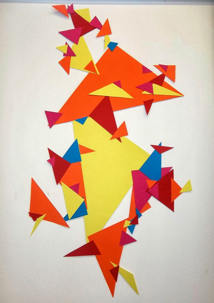
Untitled, A0, tissue paper and PVA with coloured card on canvas, March 2014.


Statement for Self-directed work:

I went on a train journey from Leicester to London and quickly drew whatever shapes caught my eye, some within the train most from outside the window. When I got back to the studio I started experimenting with what I could do with the shapes how I could compose them on paper. I immediately thought of last terms work and thought I could build on that using these new shapes to explore that style of composition which I found from Kandinsky's abstract work, use watercolours at first focusing on basic black lines with fill in colours. When I showed this to a fellow student she said it reminded her of Joan Miro work, I have looked at Miro's work in the past and saw the link straight away.

I then chose to stick with certain shapes and leave the rest behind me, put all my focus onto just some of the shapes. I liked working with the triangles and circles most, so I cut out these shapes from coloured card. I chose the brightest colours I could, having recently looked at Peter Halley’s work, I was interested in making the brightest work possible. Halley uses almost neon bright paints to create painting of geometric shapes on canvases.    

After my experiments using collage, I found the work of Marcelo Jacome’s work at the Saatchi Gallery in London, the colours he uses and the shapes they make reminded me of my work. Taking my work 3D felt like the right move forward, the shapes had already come off the paper, taking them off the wall seemed to make sense. I experimented a lot with the 3D element of the shapes, although I felt the triangles and circles belonged on the wall, but I like using tissue paper to create the shapes. I thought this would be an interesting textual contrast to the sharpness of the card. I could create the squares using florescent coloured card on a canvas and have the tissue paper in the background – so some parts would show through were the card wasn’t.

When applying the tissue paper triangles to the canvas, the PVA took some of the dye from the paper and it dripped down the canvas, over the some shapes – I like the effect this gives, it adds to what I saw in the tissue paper shapes to begin with. The card shapes would never have done that, I believe that the harsh card and breakable tissue paper shapes would add to the contrast of the colours and the differences in shapes.     

Wednesday, 2 April 2014

Peter Halley:


I looked at Peter Halley's work in reference of my self-directed work because he uses really bright, almost neon colours in his paintings. Some parts also look as though they have rougher texture to them, I think the contrast of me working with card and tissue paper is something that would interesting when placed together. 
I want to use much brighter colours in the work, and focus mainly on triangles and squares. 

Tuesday, 1 April 2014

Henriette van 't Hoog


Installation view Flat Color: Ditty Ketting, Marije Vermeulen (3x), Guido Nieuwendijk (2x), Henriette van 't Hoog (2x) – FOR HVH 3

Colours – I really like the almost neon colours she uses. Their so bright that it’s impossible to miss. The ‘cubes’ works that I’m talking about are what inspired me to take my work off the wall and just focus on the shapes. Her work is painted straight onto the wall so she very much works with the space she’s given. Although my work is mounted on the wall, not glued straight onto it, I am working with the space a lot more than I have previously.

I also enjoy the amount of white space she leaves, she doesn't over crowd the audience and understands that, because of how bright the colours are, you don’t need as much of it – it would be too much for your eyes to take in.

I plan to use more vibrant colours, attaching them to straight to the wall, using them to join some canvases that I will space out randomly across the wall. I think this fits well with how this theme came about, I saw the original shapes though a window, so I think this is a good move forward. I enjoy the shapes being free, but I chose to experiment on a canvas – the parameters remind me of a window. Dotting the canvases around a space links with how I got the shapes, I took them from the landscape and they evolved into what I’m doing now, and to me the presentation of the shapes links the start with the finish very well.


Monday, 31 March 2014

Friday, 28 March 2014

Jim Lambie


Recently I have been thinking about using the floor as well as the wall. Most of my work is created on the floor and I work on it from all angles, so I never know what way up its going to be until it’s finished. I think it will be interesting to view it on the ground, I’m also thinking about it becoming interactive with the audience – I was inspired by a journey, and all though my work has slowly evolved away from what it started out being, I would still like it to reflect in the final piece. The viewers will be able to step into my world and travel past and though the space as I did so many months ago, seeing them how I saw them.

Jim Lambie’s floor installations have motivated me to work with the floor, I have already forgotten about the background and am working with just the shapes and placing them straight on the wall. I found cutting the shapes and the sticking them onto the paper to constricted, I only wanted to focus on the shapes and thought the paper was a waste.

Lambie uses multi-coloured vinyl tape to create these illusional works of art and each piece will change to the site that it’s in, the tape has to move around the shape of the room and the object within it (posts, stairs and pillars etc..)

This process, again, relates to my work at the moment as I am focusing on the positive and negative shapes I create. I’m aware when arranging the shapes of the shape of the scape I leave behind.  

Friday, 21 March 2014

Marcelo Jacome


Marcelo Jacome's Planos-pipas, 2013, tissue paper, bamboo, fiberglass and cotton thread, Saatchi Gallery, London.

I was at a loose end as to where to take the project next, but after seeing this piece, I wanted to experiment with creating a wooden sculpture and covering it with tissue paper, attaching both elements using glue - glue gun for the wood and PVA for the tissue paper. I also wanted the piece to have a glossy finish and I knew that PVA would do that. 

This felt like the right direction to take my work because it was restricted by the wall and by working 3D I was able to use all space.


Untitled, wooden sticks and glue, March 2014

Photographed above is the result of my experiment with the wooden structure idea, before I test out the tissue paper on a smaller version of it (below).


The tissue paper worked as I expected it too, it stretched across the sticks but it didn't fit as easily as I thought it would and ripped easily. I preferred the structure without the colour, you could see the lines of the shapes more clearly and I like the way the light blocks your view to the structure, and the wind makes it move slightly. 


Thursday, 13 March 2014

Experiments with colour:


View from the stairs - Pixels, 3.5m x 1.5m (approx), coloured card mounted on the wall, March 2014.


Untitled, 1m x 1.3m (approx), coloured card mounted on the wall, March 2014. 

Wednesday, 12 March 2014

Experiments without paper

Triangles, coloured card mounted on wall, March 2014.

Bubbles, coloured card mounted on wall, March 2014.

Monday, 17 February 2014

Experiments with collage


Untitled, A3, Collage of colour paper, Feb 2014.

Untitled, A3, Collage of colour paper, Feb 2014.


Untitled, Collage of 5 coloured sheets of A4 card placed together, Feb 2014.


Tuesday, 11 February 2014

Joan Miro


I looked at Miro’s work in relation to my self-directed project, however I do believe that it will also impact my drawing, as they are very similar. I find Miro’s work interesting because of his use of composition, the way the objects just seem to float there within a blank space. Sometimes the background is coloured, other times the paint is unevenly coated across the surface, which is normally a canvas.
I want to explore the shapes that I have taken from the landscape and turn them into something that’s fascinating and takes the viewer into another world.
I want to experiment with different colour background to take away that plain old white-ness. 

Henri Matisse


The Horse, the rider and the clown from the illustrated book ‘jazz’ 1947

The Snail 1953
Gouache on paper, cut and pasted on paper 
mounted on canvas support: 2864 x 2870mm

I was in a critique the other day and Matisse’s paper cut outs came up in relation to my self-directed work, so I decided to look into them more - hoping that it would spark an idea so I could take my work further. I started cutting shapes out of sheets of coloured paper and composing them on different types of backgrounds – plain paper, paper that I had painted and coloured card, trying different colours and layouts to see what works. 

The main inspiration that Matisse gave me was the scale that he works on. Some of his works are huge, easily taller than me – this made me want to work big again, most of the pieces I have done lately are A4 or A3. I want to do huge wall size pieces that you simply can’t walk past, I'm also want to try pieces on card or wood – something stronger than paper, it's too curly with all the glue.


A quality of The Snail piece, which is perhaps my favourite out of his cut outs, is the irony of it. The piece itself is huge (as you can see in the photo on the right) and colourful yet its of a snail - which is brown and dull and small. 

Friday, 31 January 2014

Jim Dine


A painted Self Portrait (top)
1970
152.4 x 101.6 cm Hodkinson mould made paper
The second edition of seven variations of the coloured bathrobe
.
Jim Dine did a lot of work based on the one above over the seven years that the book covers, I believe a painted self-portrait to be the second of seven. He experimented with a variety of techniques – lithograph, etching, woodcut, but the first was a stencil piece in 1970.
The black and white self-portrait using a stencil, which were cut by the printer (Maurice Payne) from the outline drawing that Dine had done on a large piece of Masonite, and the Masonite “puzzle” was then placed on a large piece of paper and spray painted as each piece was lifted one at a time. But I prefer this piece above, a painted self-portrait, was drawn and painted by Dine. This piece reminded me of my own work, I’m currently working with blocks of colours, distinctively separating the tones of the subject to show the audience more clearly what I see in the objects.  

Wall Chart II (bottom)
1974
Lithographs from 4 stones and 4 zinc plates
Printed in 36 colours on a sheet of 121.9 x 88.9cm Rives paper
Edition record: 75

I also liked his ‘Wall Chart II’ lithographs from 1974, they have a quality of looking simple and complex at the same time. The technique itself requires concentration, Dine has written one word on each square, which are sometimes obscured depending on the amount of printing ink applied. The squares are laid out in a grid format. It’s so easy to look at it and just see a cheque design with scribbles on them, but it’s so much more than that – it’s a documentation of a process. It has reputation as well as uniqueness, each square has a different amount of ink on it so each has its own lines and occasional light colour.  


Images and information from: JIM DINE PRINTS 1970-77, Harper and Row Publishers in 1977, 1st edition, Pages 48 & 49, 92 & 93.

Friday, 24 January 2014

Untitled Printing Experiments

Untitled, A1, Acrylic paint on paper, January 2014.

Untitled, A1, Acrylic paint on paper, January 2014. 

Untitled, A1, Acrylic paint on paper, January 2014.

Untitled, A1, Acrylic paint on paper, January 2014.

Wednesday, 22 January 2014

Untitled Experiments

Untitled, A4, Acrylic paint on paper, January 2014.

Untitled, A4, Acrylic paint and watercolour on paper, January 2014.

Untitled, A4, Acrylic paint on paper, January 2014.

Untitled, A3, Acrylic paint on paper, January 2014.